Tailwind CSS Grids - How to use grid with Tailwind
By: Erwin, 19 April 2023
Category: #quickoverview
In this Quick Overview, we will explain Grid layouts in Tailwind CSS. We will dive into what grid layouts are, the difference between grid and flex and how to create grid layouts using Tailwind CSS. After that, we will talk about grid structure, item placement, order, alignment, and the usage of arbitrary values with Tailwind grid classes. Ready? Let's get started!
What is a Grid Layout?
The Grid layout is an easy way to organize elements in a container. It helps control the position, alignment, and size of elements, making responsive user interfaces look better. Grid layouts replace older, less flexible methods, making it simpler to create designs that work well on different devices and screen sizes.
Difference between grid and flex in Tailwind
Both grid and flex in Tailwind CSS are powerful layout systems that can help you with creating responsive and adaptive designs. However, there are some key differences between the two. The grid layout is a two-dimensional system, allowing for the control of both columns and rows, while flex is a one-dimensional system that primarily focuses on controlling the layout along a single axis (either horizontal or vertical). Besides that, grid layouts can handle overlapping elements more effectively, whereas flex layouts are better suited for distributing space along a single axis.
How to make grid layouts in Tailwind
Tailwind offers a variety of pre-built classes, enabling you to easily construct responsive and adaptable grid systems. To start, apply the grid class to a container element, followed by grid-cols-{value} and grid-rows-{value} classes to define the number of columns or rows.
Additionally, Tailwind allows for precise control over grid item placement, alignment, spacing, and sizing, as well as the ability to create auto-sized columns and rows, resulting in highly customizable grid layouts to suit your exact requirements. We'll go further into detail a bit later in this article.
Here is a basic example that shows where to place these classes:
<!-- Grid container -->
<div class="grid grid-cols-3">
  <!-- Items inside the grid container -->
  <div>Item</div>
  <div>Item</div>
</div>
Control the grid layout in Tailwind
Template Columns and Template Rows
In Tailwind CSS, you can define the structure of your grid layout by specifying the number of columns and rows using the grid-cols-{value} and grid-rows-{value} classes. For example, to create a grid with three columns and two rows, you can use the following classes:
<div class="grid grid-cols-3 grid-rows-2">
  <!-- Six grid items go here -->
</div>You don't always have to specify both the amount of columns and amount of rows, though. For example, if you load data that is dynamic, it's best to define just one of the two.
Column Start/End and Row Start/End
To control the placement of grid items within the grid layout, Tailwind CSS offers a variety of classes for defining the start, end, and span of columns and rows. These classes allow you to precisely position and size grid items:
Row and column span: Determines how many columns or rows a grid item should occupy.
- col-span-{value}: Specifies the number of columns a grid item should span. Possible values are 1-12 and full.
- row-span-{value}: Specifies the number of rows a grid item should span. Possible values are 1-6 and full.
Row and Column start: Specifies the starting point of a grid item within the grid.
- col-start-{value}: Specifies the column where a grid item should start. Possible values are 1-13 and auto.
- row-start-{value}: Specifies the row where a grid item should start. Possible values are 1-7 and auto.
Row and Column end: Indicates the ending point of a grid item within the grid.
- col-end-{value}: Specifies the column where a grid item should end. Possible values are 1-13 and auto.
- row-end-{value}: Specifies the row where a grid item should end. Possible values are 1-7 and auto.
Here is an example showing the use of span, start and end with rows and columns in a grid that has 6 columns and 3 rows:
<div class="grid grid-cols-6 grid-rows-3">
  <!-- Grid item with col-span-3 -->
  <div class="col-span-3">
    Item 1 (col-span-3)
  </div>

  <!-- Grid item with col-start-4 and row-span-2 -->
  <div class="col-start-4 row-span-2">
    Item 2 (col-start-4, row-span-2)
  </div>

  <!-- Grid item with col-end-6 and row-start-2 -->
  <div class="col-end-6 row-start-2">
    Item 3 (col-end-6, row-start-2)
  </div>

  <!-- Grid item with col-span-full and row-start-3 -->
  <div class="col-span-full row-start-3">
    Item 4 (col-span-full, row-start-3)
  </div>
</div>Auto Columns, Auto Rows, and Auto Flow
The following are classes for creating auto-sized columns and rows within your grid layout. These classes help manage the size of the grid tracks, adapting them based on the content they hold.
For auto-sized columns, use the auto-cols-{value} class, where {value} can be one of the following: auto, min, max, or fr. These values determine the sizing behavior of the auto-generated columns:
- auto-cols-auto: Column size adapts to the content size, without causing overflow or wrapping.
- auto-cols-min: Column size is set to the minimum value that prevents overflow or wrapping.
- auto-cols-max: Column size is set to the maximum available space, distributing it evenly among columns.
- auto-cols-fr: Column size is set to a flexible fraction of the remaining space, using the CSS minmax(0, 1fr). Want to learn more about the fr unit? Check out this comprehensive guide by CSS-Tricks.
Similarly, for auto-sized rows, use the auto-rows-{value} class, where {value} can also be auto, min, max, or fr. These values determine the sizing behavior of the auto-generated rows:
- auto-rows-auto: Row size adapts to the content size, without causing overflow or wrapping.
- auto-rows-min: Row size is set to the minimum value that prevents overflow or wrapping.
- auto-rows-max: Row size is set to the maximum available space, distributing it evenly among rows.
- auto-rows-fr: Row size is set to a flexible fraction of the remaining space, using the CSS minmax(0, 1fr). Want to learn more about the fr unit? Check out this comprehensive guide by CSS-Tricks.
To control the flow direction of grid items, use the grid-flow-{value} class, where {value} can be one of the following: row, col, row-dense, col-dense, or dense. These values determine how grid items are placed and how auto-generated tracks are created:
- grid-flow-row: Grid items are placed in rows, and auto-generated tracks are created horizontally.
- grid-flow-col: Grid items are placed in columns, and auto-generated tracks are created vertically.
- grid-flow-row-dense/grid-flow-col-dense: Grid items are placed in rows or columns, respectively, and auto-generated tracks are created to fill any available gaps in the grid.
- grid-flow-dense: Grid items are placed in either rows or columns, depending on the available space, and auto-generated tracks are created to fill any gaps in the grid.
Order and Gap
You can control the order of grid items and add gaps between them using the order-{value}, gap-{value}, gap-x-{value}, and gap-y-{value} classes. For example, to create a grid layout with a gap of 1 rem between columns and rows, you can use gap-4:
<div class="grid grid-cols-3 grid-rows-2 gap-4">
  <div class="order-last">Item 1</div>
  <div>Item 2</div>
  <div>Item 3</div>
  <div>Item 4</div>
</div>The order classes range from order-1 to order-12, as well as order-last, order-first, order-none, and negative orders. You can also use arbitrary values for more flexibility. See our Quick Overview for Flexbox for more examples with gap and order.
Grid item placement in Tailwind
In this section, we'll explore the most important aspect of grids: item placement. Learn how to effectively position, align, and control individual grid items using Tailwind's utility classes for a polished grid layout.
Justify content, self and items
- justify-{position} (also called
justify-content): Aligns all items within the container along the main axis based on the specified position. Possible values for position are normal, start, center, end, between, around, stretch and evenly. - justify-items-{position}: Aligns all items within the container along the item's inline axis based on the specified position. Possible values for position are start, center, end and stretch.
- justify-self-{position}: Aligns an individual item along it's inline axis according to the provided position. Possible values for position are start, center, end, auto and stretch.
<div class="grid justify-{position}">
  <div>Item 1</div>
  <div>Item 2</div>
</div>

<div class="grid justify-items-{position}">
  <div>Item 1</div>
  <div>Item 2</div>
</div>

<div class="grid">
  <div class="justify-self-{position}">Item 1</div>
  <div>Item 2</div>
</div>
Examples for justify-{position}
Place these classes on the parent container that also contains the class grid.
Examples for justify-items-{position}
Place these classes on the parent container that also contains the class grid.
Examples for justify-self-{position}
Place these classes on the individual grid item(s). It's especially useful if you want to override the alignment of a single item.
Align content, self and items
- content-{position}: Aligns all items within the container along the cross axis based on the specified position, when there is space. Possible values for position are normal, start, center, end, between, around, stretch, evenly and baseline.
- items-{position}: Aligns all items within the container along the item's cross axis based on the specified position. Possible values for position are start, center, end, stretch and baseline.
- self-{position}: Aligns an individual item along its cross axis according to the provided position. Possible values for position are start, center, end, auto, stretch and baseline.
<div class="grid content-{position}">
  <div>Item 1</div>
  <div>Item 2</div>
</div>

<div class="grid items-{position}">
  <div>Item 1</div>
  <div>Item 2</div>
</div>

<div class="grid">
  <div class="self-{position}">Item 1</div>
  <div>Item 2</div>
</div>
Examples for content-{position}
Place these classes on the parent container that also contains the class grid.
Examples for items-{position}
Place these classes on the parent container that also contains the class grid.
Examples for self-{position}
Place these classes on the individual grid item(s). It's especially useful if you want to override the alignment of a single item.
Place content, self and items
Placing is essentially a combination of justify and align.
- place-content-{position}: Aligns all items within the container along both the main and cross axes based on the specified position. Possible values for position are baseline, start, center, end, between, around, stretch and evenly.
- place-items-{position}: Aligns all items within the container along both the item's inline and cross axes based on the specified position. Possible values for position are baseline, start, center, end and stretch.
- place-self-{position}: Aligns an individual item along both its inline and cross axes according to the provided position. Possible values for position are start, center, end, auto and stretch.
<div class="grid place-content-{position}">
  <div>Item 1</div>
  <div>Item 2</div>
</div>

<div class="grid place-items-{position}">
  <div>Item 1</div>
  <div>Item 2</div>
</div>

<div class="grid">
  <div class="place-self-{position}">Item 1</div>
  <div>Item 2</div>
</div>
Examples for place-content-{position}
Place these classes on the parent container that also contains the class grid.
Examples for place-items-{position}
Place these classes on the parent container that also contains the class grid.
Examples for place-self-{position}
Place these classes on the individual grid item(s). It's especially useful if you want to override the alignment of a single item.
Final Thoughts
Grid utility classes in Tailwind CSS provide a simple and effective way to create grid layouts and align content. In this blog post, we have covered what grid in Tailwind is and how it can be used for various layout requirements.
Check out all the Tailwind CSS grid (and flex) classes here: Tailwind CSS Grid Classes.
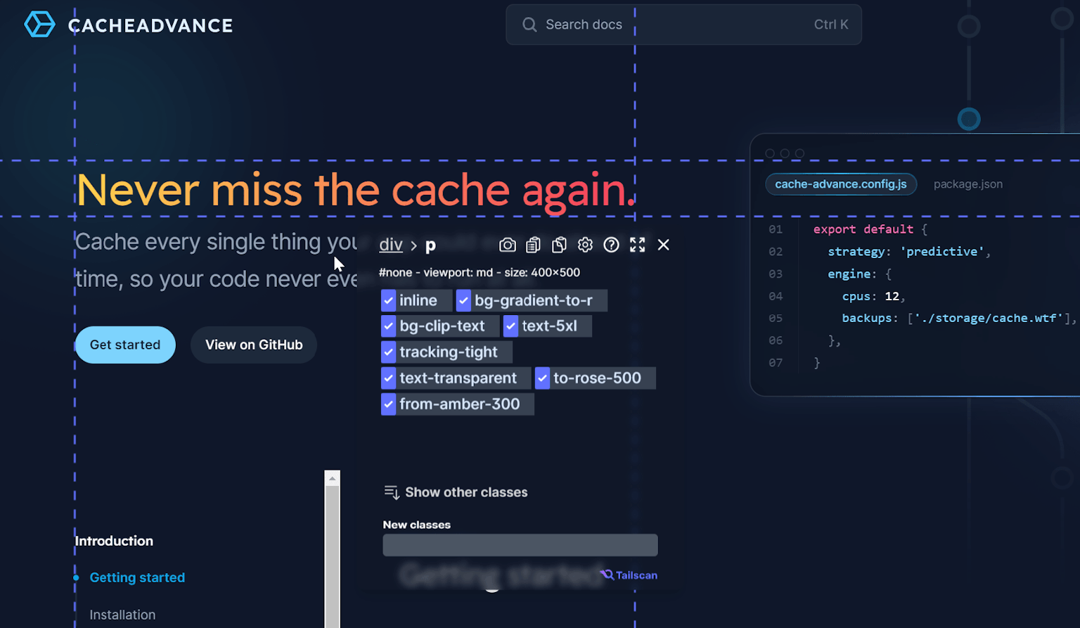
Want to get quick feedback when developing and see what all grid-related classes do instantly? Try out Tailscan below!
Tailscan will help you build grid layouts quicker by immediately giving visual feedback, making your development process more efficient and enjoyable.